INYA — product site for a SaaS
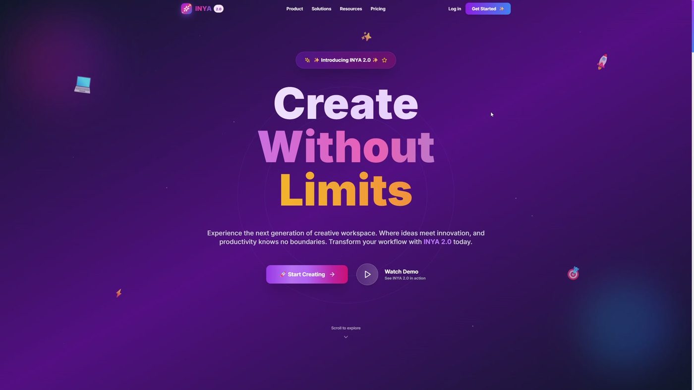
A product site that leads not to a call but to a sign-up: a demo on the first screen, interface screenshots, pricing, two language versions.
Challenge
A product works differently from a service: within one screen you must explain what it does and show the interface.
Solution
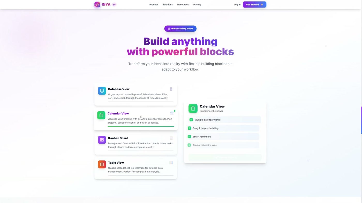
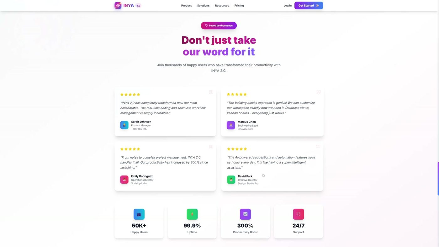
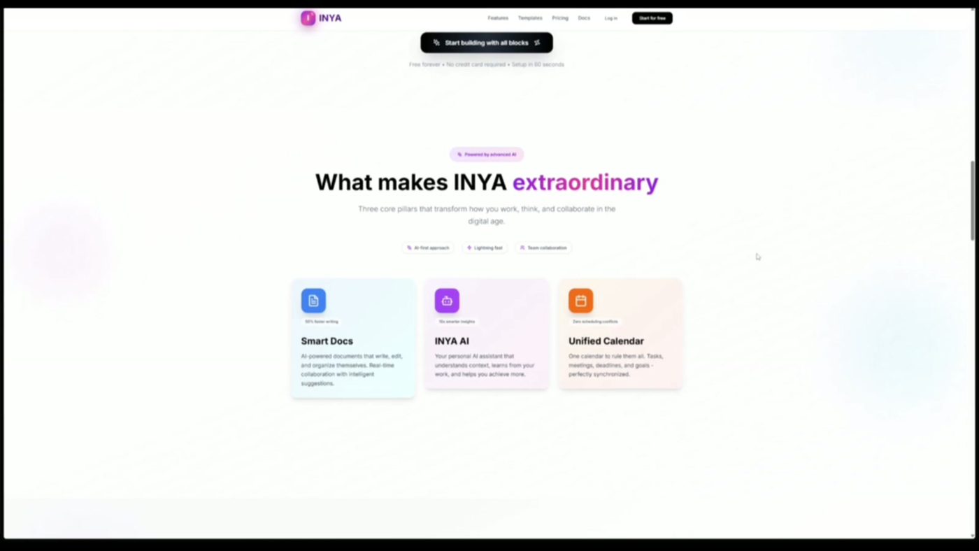
A large offer and a demo on the first screen, feature blocks with real interface screenshots, pricing with a highlighted recommended tier, testimonials and social proof, sign-up CTAs throughout the page. Two language versions — Russian and English.
Result
The visitor sees the product working and goes to sign-up, not to a “contact me” form.
Other cases
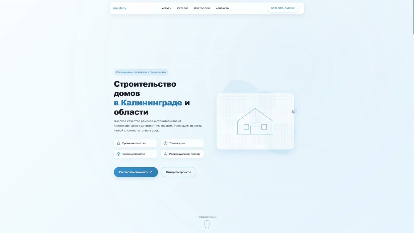
inestroy — house construction
A construction company site where the request reaches the manager with the house parameters already in it, not a blank “call me back”.
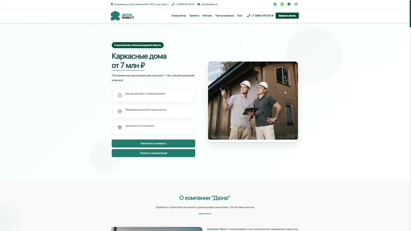
Duna — timber-frame houses
The site answers “how much is it and will the estimate double” before any form: price on the first screen, a calculator that prices a specific house.
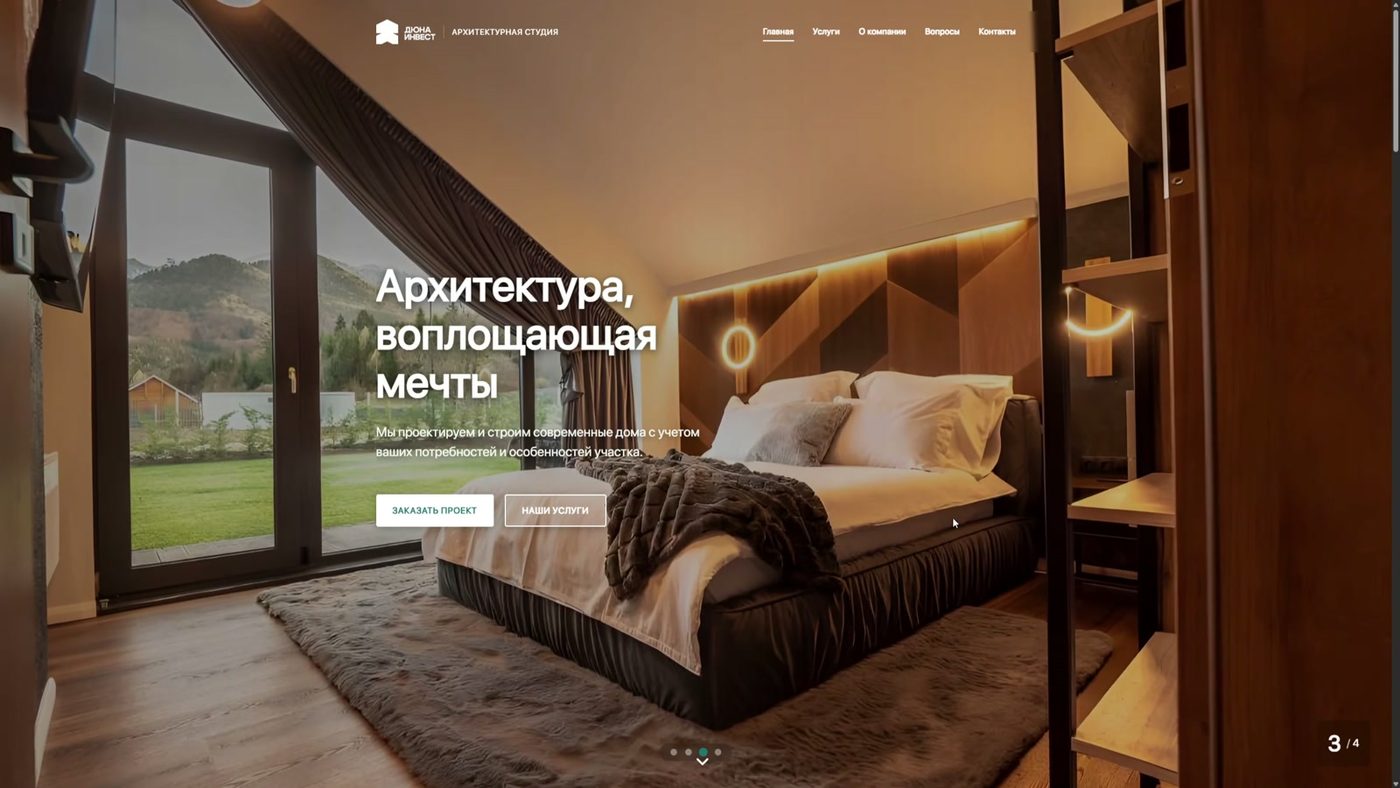
Architecture studio
A premium presentation: the site is built around the work — a full-screen project slider, a calm dark theme, not one promo banner.
Related service
Further reading
- Customer portal development cost: what actually drives the numberWhy the same-looking portal is quoted at €4k and at €40k. The four things that move the estimate, the lines that vanish from cheap quotes, and how to read a proposal before you sign it.
- All posts in category: WebsitesArticles on building sites with Next.js: what drives the price, how long it really takes, when you need a customer portal and when a landing page is enough.
Show us the one process that annoys you most
We spend 45 minutes on it together. You leave with a diagram and an estimate — even if you buy nothing from us.